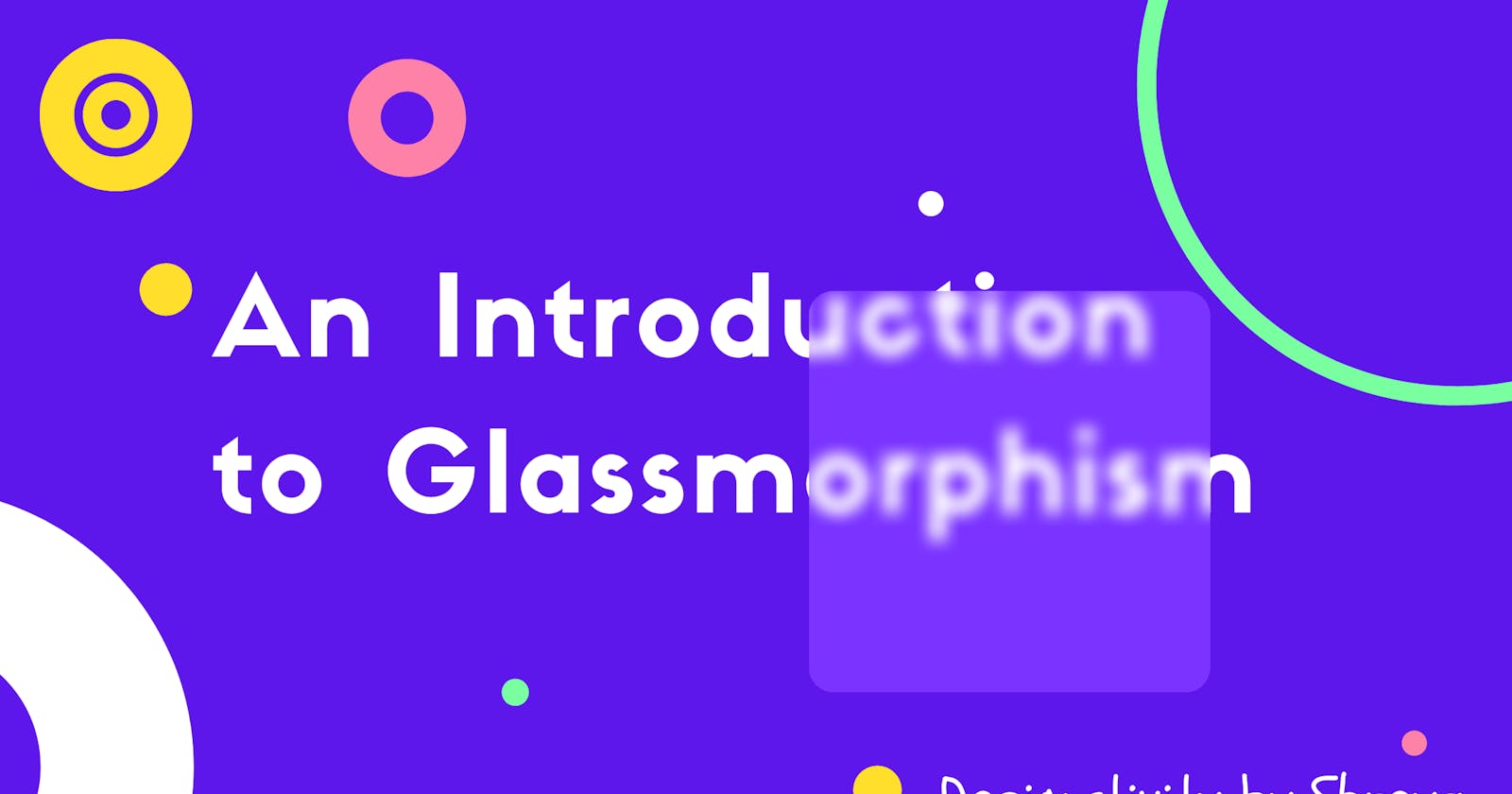
A Short Guide to Glassmorphism (Code Included)
A UI Trend that is popular among designers these days.
Contents:
- Introduction
- Code
- Examples
- Free Tools and Resources
So what exactly is Glassmorphism? As guessed by its name, it has a glassy texture with transparency. If you're into front-end development, it will take you a handful of time to understand the trend and use it right away!
I have included code blocks below and a link to a live example of the glassmorphism effect generated by me below. You will also find some resources to help you out with it. Hope it helps.
So we can generate the glassmorphism effect by a CSS property: background-blur.
Background blur creates a frosted-glass effect that ultimately leads to a transparent glassy look to our design.
Glassmorphism Without Outline
You can set and adjust the properties according to you.
background: rgba( 255, 255, 255, 0.25 );
box-shadow: 0 8px 32px 0 rgba( 31, 38, 135, 0.37 );
backdrop-filter: blur( 3.0px );
-webkit-backdrop-filter: blur( 3.0px );
border-radius: 10px;
Let's try to understand each property used here.
background: it sets background effects for our element.
box-shadow: it adds shadows to an element.
backdrop-filter: it is used to apply filter effects like blur, grayscale, contrast, etc. {major role in glassmorphism}
border-radius: generates rounded corners to our shapes/elements.
Glassmorphism with outline (bring more realistic look)
I like this one :)
background: rgba( 255, 255, 255, 0.25 );
box-shadow: 0 8px 32px 0 rgba( 31, 38, 135, 0.37 );
backdrop-filter: blur( 3.0px );
-webkit-backdrop-filter: blur( 3.0px );
border-radius: 10px;

border: 1px solid rgba( 255, 255, 255, 0.18 );  #for creating outline
Did you observe the difference? Just one line of code is required to add an outline effect to your design.
border: 1px solid rgba( 255, 255, 255, 0.18 ); #for creating outline
Here is my live example. Play along:
Tools & Resources:
Color Hunt: If you're like me who finds it hard to choose color combinations and for having great color inspiration, this one is a must have!
Color Space: For generating nice color palettes.
CSS Gradient io : To create a gradient background for websites.
Css-Gradient : Gradient generator for linear and radial css color gradients.
Color Zilla: Photoshop-like CSS gradient editor from ColorZilla.
Examples: Dribble and Behance [Design Analysis]
 Glassmorphism design by Liubov Petrenko
 Glassmorphism design by Ibrahim emran
 As always, thank you for your time. If you liked it, please react to this blog, it appreciates me to write more. If you've any doubts let me know in the comment section.
Connect me here: Twitter | Blog | Medium :)
